
In April we shipped the Mobile Check-In App, and said at the time that we believe Progressive Web Apps can offer a superior experience for mobile users. This update is us following through on that. The check-in app is now a full studio app: five tabs across the bottom — Check-In, People, Appointments, Collect, and Messages — and it's significantly faster than the version we launched with.
As before: it's the same data as your desktop, there's nothing to install from an app store, and if you already added the app to your home screen you don't need to do anything. It updates itself.
Here's what's new.
People
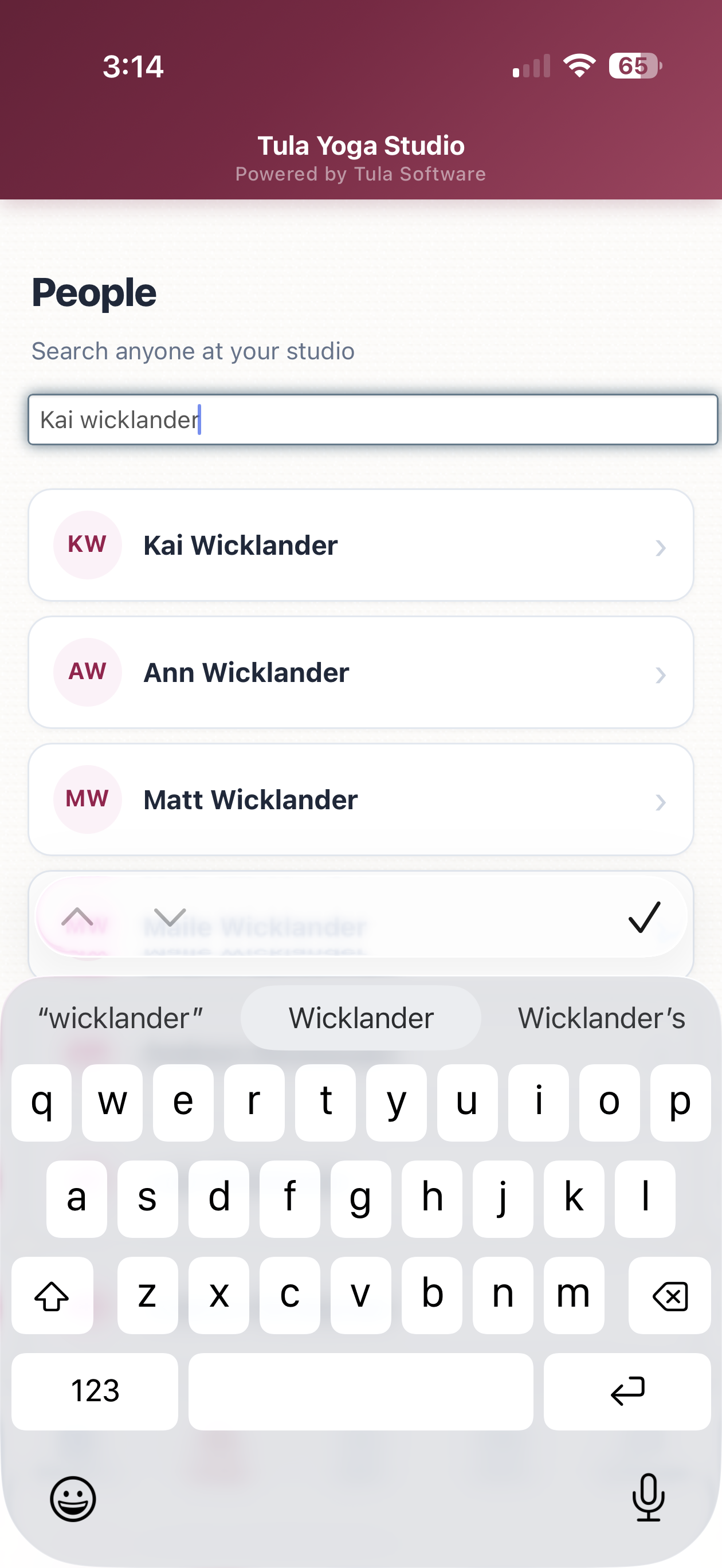
People now has its own tab. Search anyone at your studio by name or email and open their full profile — contact info, credits, passes, payment history, attendance, and upcoming registrations. The tab also shows who checked in recently, so the person you just worked with is one tap away.
Appointments
You can now see and manage appointments from your phone:
Upcoming appointments are listed by day. Each card shows the service, the client, the time, and the provider. Tapping an appointment opens its check-in screen — because an appointment is an event, you check people into it the same way you check them into a class.
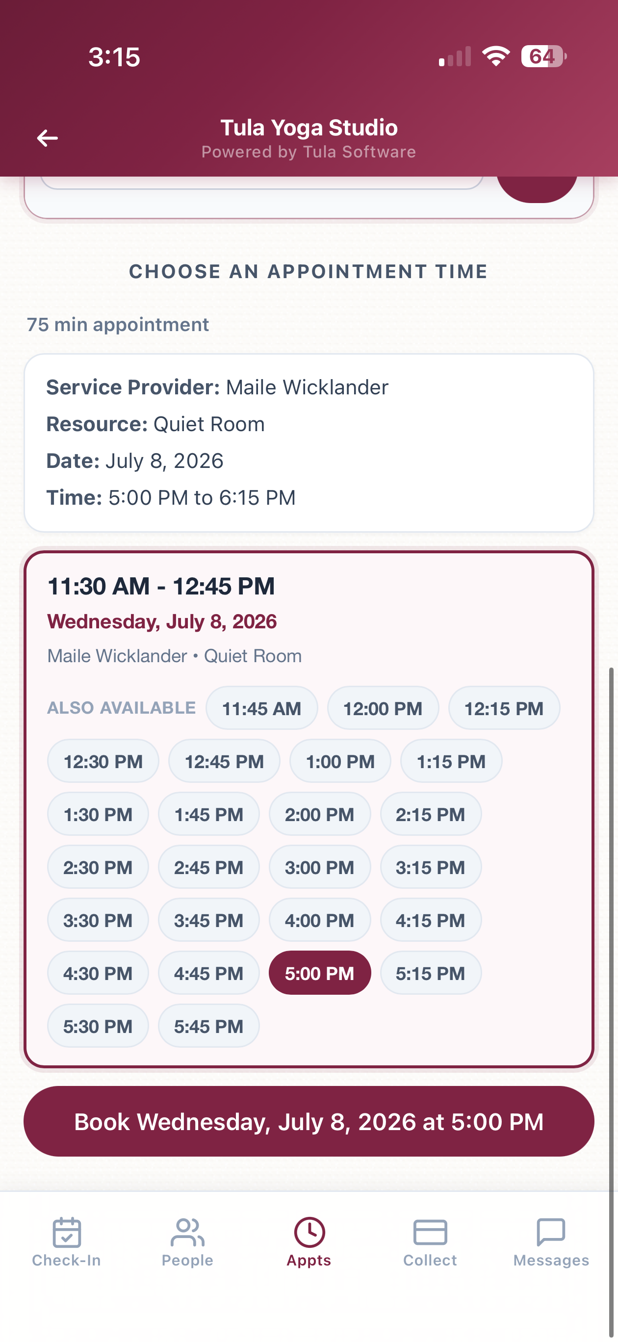
Booking a new appointment works the way the student booking page works: pick the person, pick the service, then ask the booking agent for times ("What's open Thursday afternoon?") or check a specific date. The agent replies with actual open slots, you tap one, and book it. The agent handles provider and room assignment as part of the conversation.
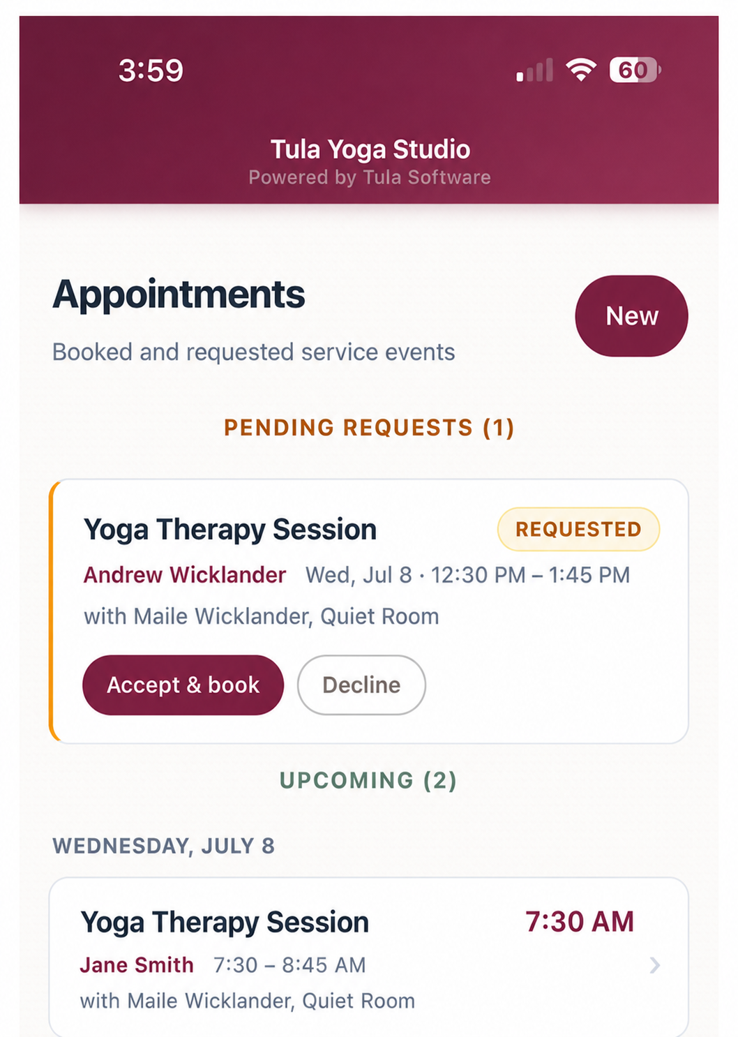
Pending requests from students appear at the top with Accept & book and Decline buttons. Accepting creates the booking and sends the same confirmation texts and emails as accepting from the desktop. Declining notifies everyone too. It's the identical logic behind the desktop requests page and SMS replies — just available from your phone now.
Collect payment
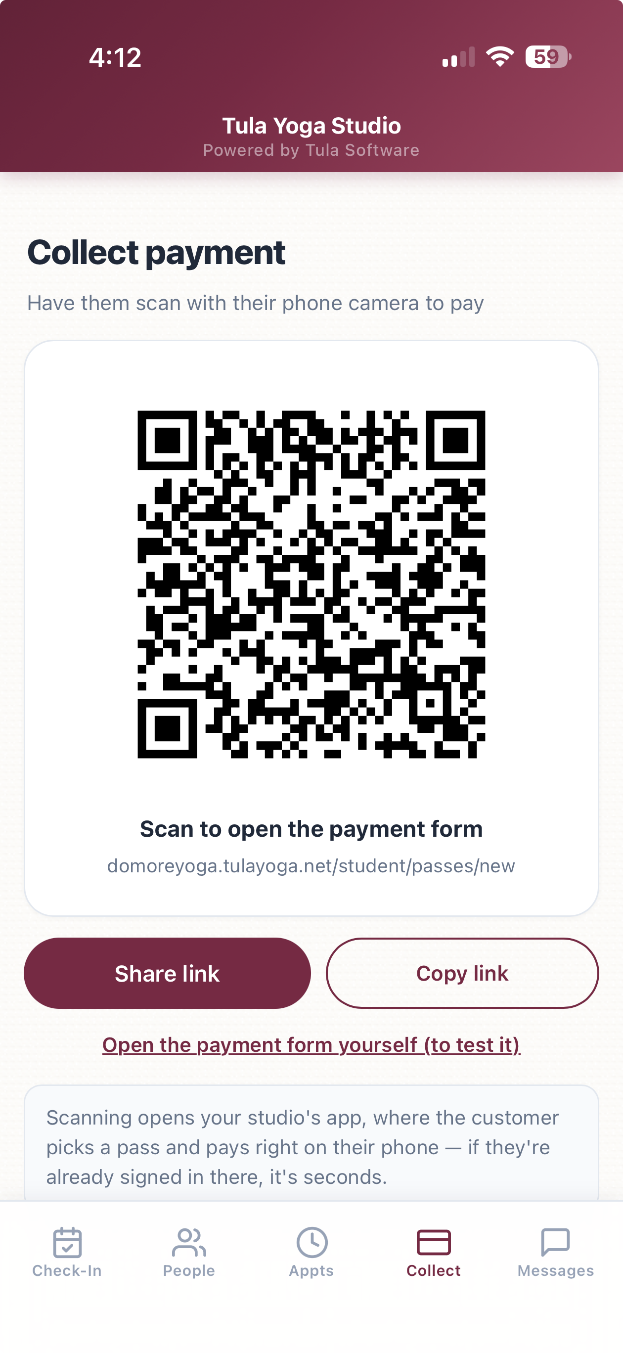
There's a new Collect tab for taking payment in person. It shows a QR code — the customer scans it with their phone camera and lands on your studio's app to buy a pass. If your studio has its own domain configured, the QR uses it, so customers who are already signed in there skip login entirely.
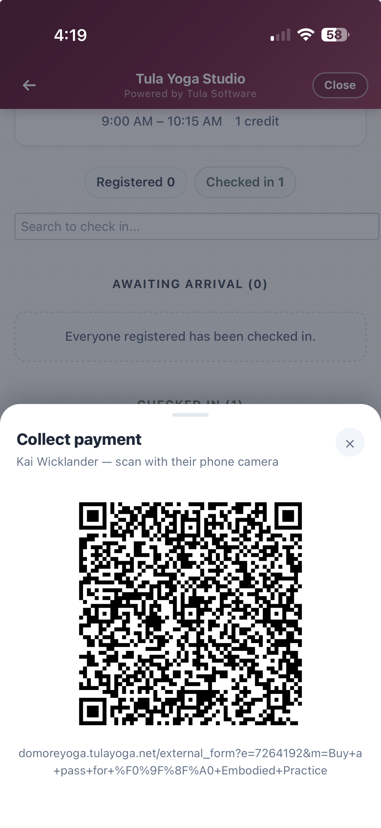
This also connects to check-in. When someone checks in without a pass, their card shows an Unpaid badge with a Collect payment button. Tapping it slides up a QR code for that specific class — scanning opens your payment form showing only the pass types valid for that class. You never leave the check-in screen.
Messages
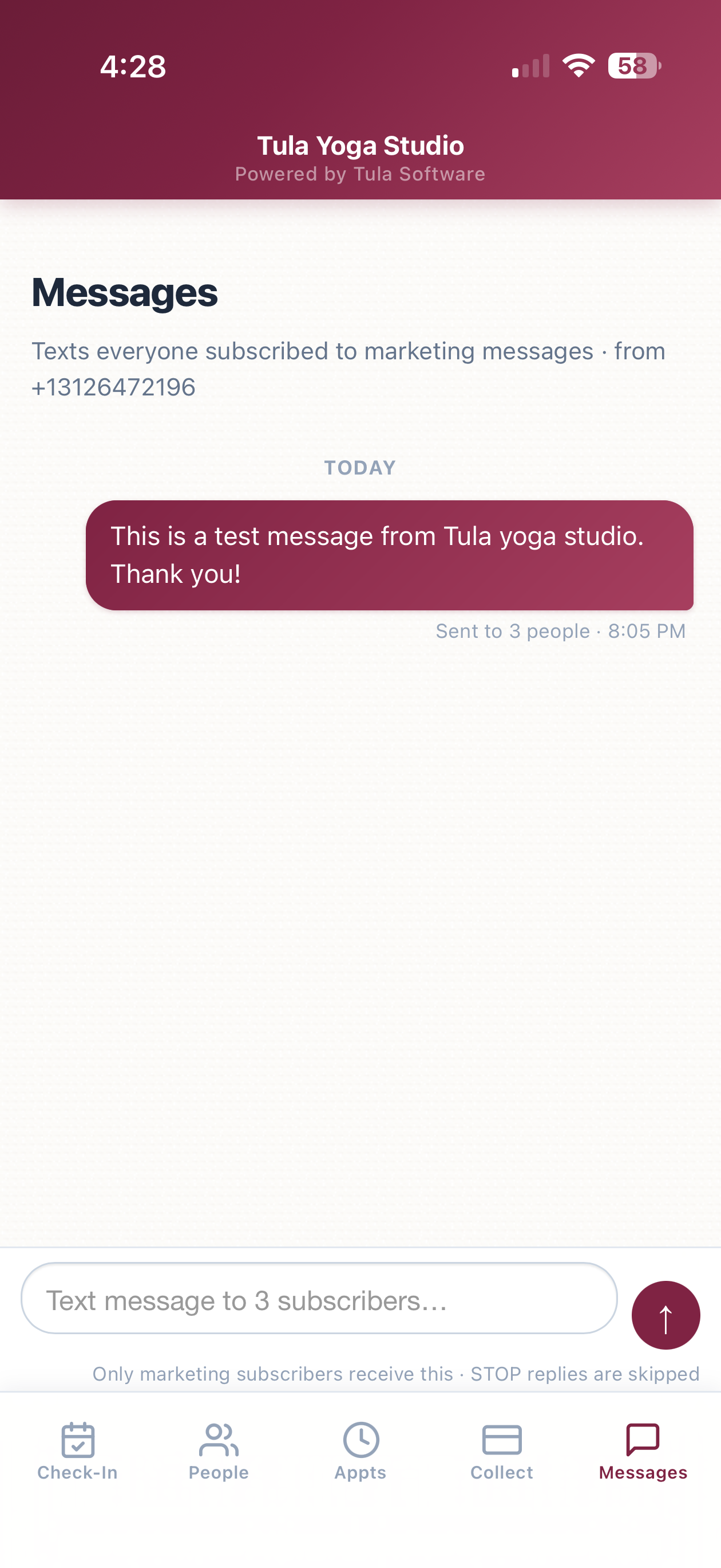
Owners and admins get a Messages tab: a fast way to text everyone subscribed to marketing messages at your studio. It looks like a normal messaging thread — your past sends as bubbles, a composer at the bottom, and a recipient count so you know exactly who you're reaching before you hit send.
A few facts about how it works:
Only people with an active marketing text opt-in receive it. Anyone who replied STOP is skipped automatically.
Messages send from your studio's own number, through the same compliance pipeline as the rest of Phone Numbers.
Each message shows real delivery data as carriers confirm it — "Received by 30 of 42 people" — not just "sent."
The kiosk gets a register & pay QR code
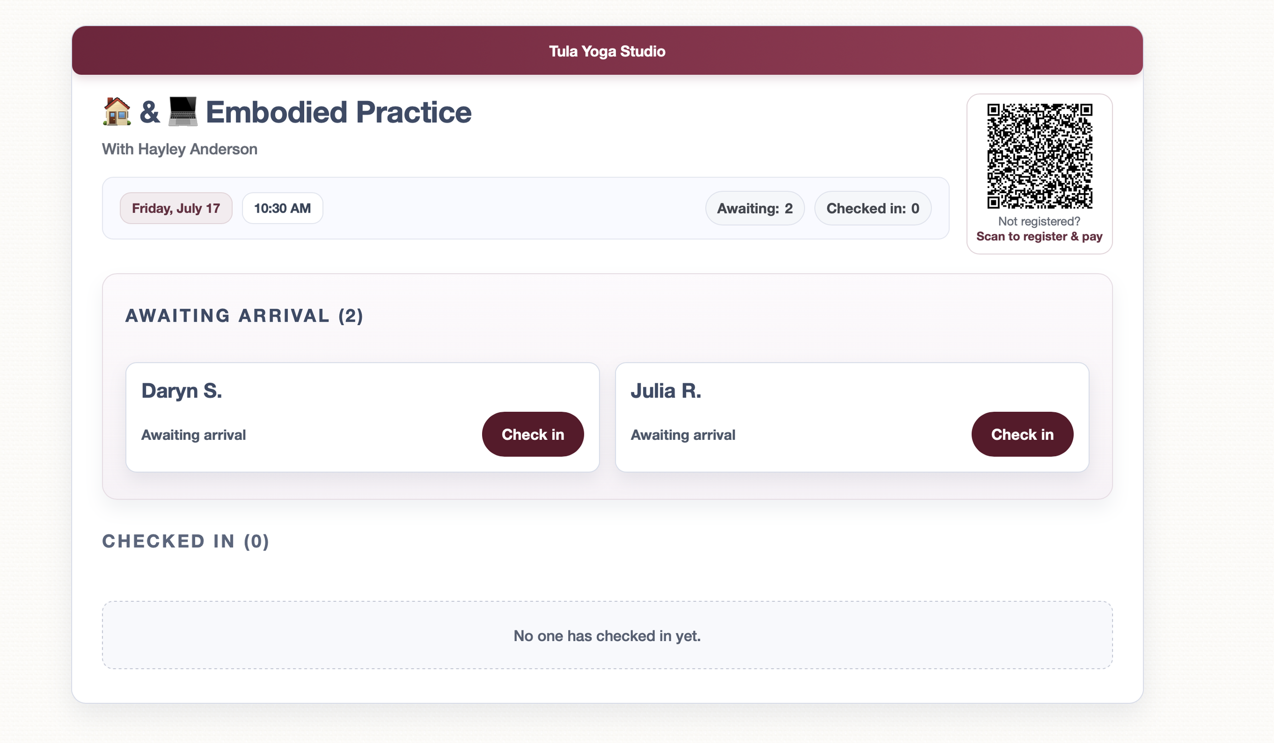
The self-service kiosk got an upgrade too. When a class still has space and has publicly purchasable passes, the kiosk page now shows a QR code next to the roster. Someone who walks in unregistered scans it, pays on their phone, and is registered for that class — no staff involvement. Like the mobile app's QR codes, it points at your studio's own domain when you have one set up.
Speed
We rebuilt how the mobile app loads and navigates; we're treating PWAs as a core product.
The app now ships about one sixth of the JavaScript it used to. Less to download, much less for your phone to parse on every launch.
Switching tabs starts loading the moment your finger touches the screen, and the app paints the last version of a page instantly while the fresh one loads behind it. In practice, tab switches feel immediate.
Cold launches show a branded loading screen instead of a white page, and static files are cached on the device so repeat launches skip the network almost entirely.
Dozens of smaller changes: system fonts, no tap delay, press feedback on buttons and cards, and page transitions on browsers that support them.
Getting started
Nothing to set up. If the app is on your home screen it's already updated; if not, open the menu in the upper right of your Tula dashboard, go to Mobile Admin Apps, and follow the instructions. Access works the same as before — Owners, Admins, and Desk Staff — and the Messages tab is limited to Owners and Admins.
We hope you love this as much as we do and as always, if we can help you with anything reach out to our help email!