New Features! The Library, Newsletters, and Event Pages

We’re excited to announce another big set of updates: the Library, a brand new Newsletter and email editor, and Individual Event Pages.

Every studio produces content all the time. There's the recording of Saturday's workshop, the photos from teacher training graduation, the voice memo your lead instructor made about breathwork, and the flyer for next month's retreat. Most of that ends up scattered across phones, Google Drives and old email threads, and when it's time to send a newsletter or promote an event, you spend an hour hunting for it.

So this summer we built three connected pieces to fix that. The Library holds everything in one place. The Newsletter sends it to your community. And Event Pages give every class, workshop and retreat a beautiful page you can share anywhere.
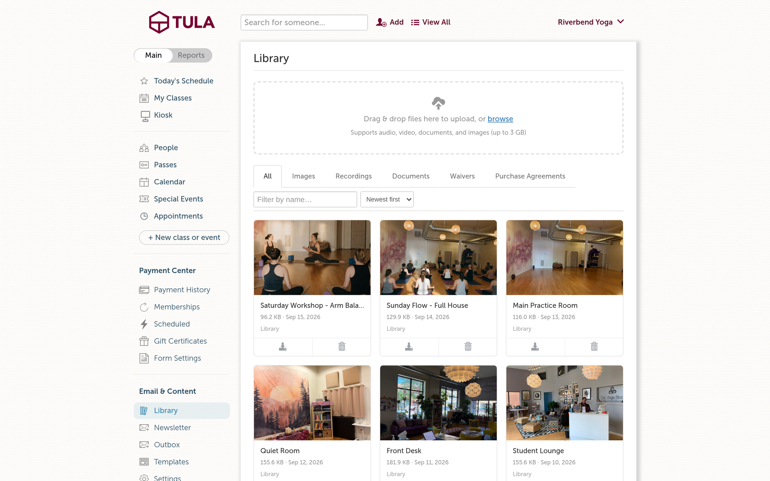
The Library, All tab.

The Library: one place for all of it

The Library now lives under Email & Content in your left nav, and it holds everything your studio uploads: images, audio, video, documents, and the waivers and purchase agreements your students have signed. Tabs across the top let you jump straight to Images, Recordings, Documents, Waivers or Purchase Agreements, and you can search and sort by newest, oldest or name.

A few things we're especially happy with:

  • Big files are fine. Upload audio, video, documents and images up to 3 GB each, including the .mov files that come straight off an iPhone.

  • Recordings play right on the page. Click any video or audio recording and it opens in a player without downloading first. The download button is still there if you want the file.

  • Your class recordings live here too. Event recordings sit beside your own uploads, so everything is in one place.

You choose who sees each recording

Every recording starts out private, and from there you decide where it goes. Private means only your team can see it. On-Demand means students can watch it in your On-Demand widget. Public means anyone can see it. You can also Feature a recording on your studio page, so your best content is the first thing people see.

Embed a single video on your website

Every video in the Library now has an Embed button. Click it and you'll get a live preview and a snippet you can copy into your website, the same way you already embed your calendar and payment forms. It works for your uploads and your class recordings, and if you have a custom subdomain, the embed uses it.

This is perfect for a welcome video on your homepage, a sample class on your teacher training page, or a teaser for an upcoming retreat.
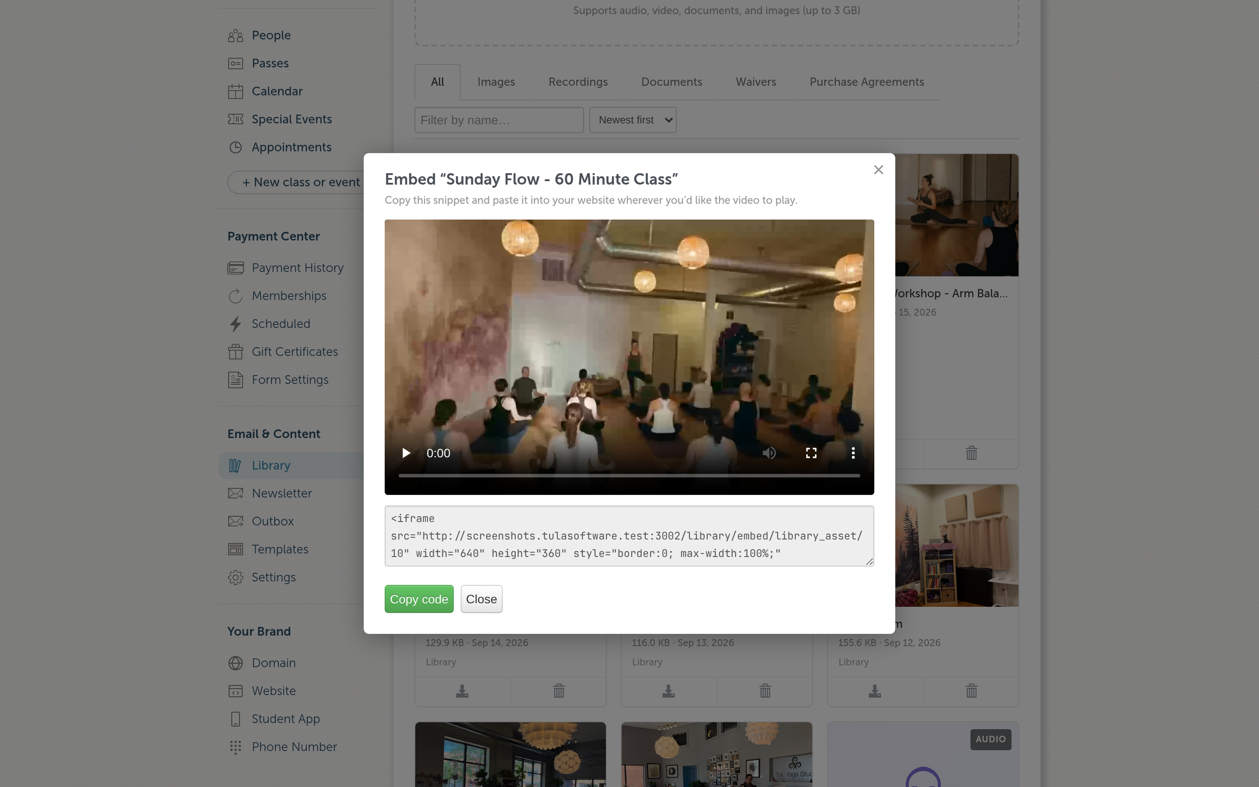
The Embed dialog, with a live preview and the snippet to copy.

The Newsletter: tell your community what's happening

Once your content is in the Library, the next step is getting it in front of people. There's now a Newsletter link under Email & Content. It opens a composer that's already addressed to every member who is subscribed and can receive email, so there's no list to build.

We also rebuilt the email editor from the ground up. It powers the newsletter, group emails, campaign templates and purchase follow-up emails, and it's a big upgrade:

  • Pull images straight from the Library. Type ! and pick an image. No downloading and re-uploading.

  • Drag, drop or paste images. Anything you add is saved to the Library under Email Content, so you can use it again next time.

  • Personalize with merge fields. Type * to add a student's first name or other details, or pick from the menu above the editor.

  • Organize your templates. Give templates any category you like (Welcome, Workshops, Monthly Newsletter), and the "Use a template" menu is grouped by category, so the right starting point is easy to find.

  • Send yourself a real test. The button shows exactly where your test is going ("Send a test to you@yourstudio.com"). Your test arrives with the merge fields filled in, so you see what your students will see. And the unsubscribe link in a test won't unsubscribe you.
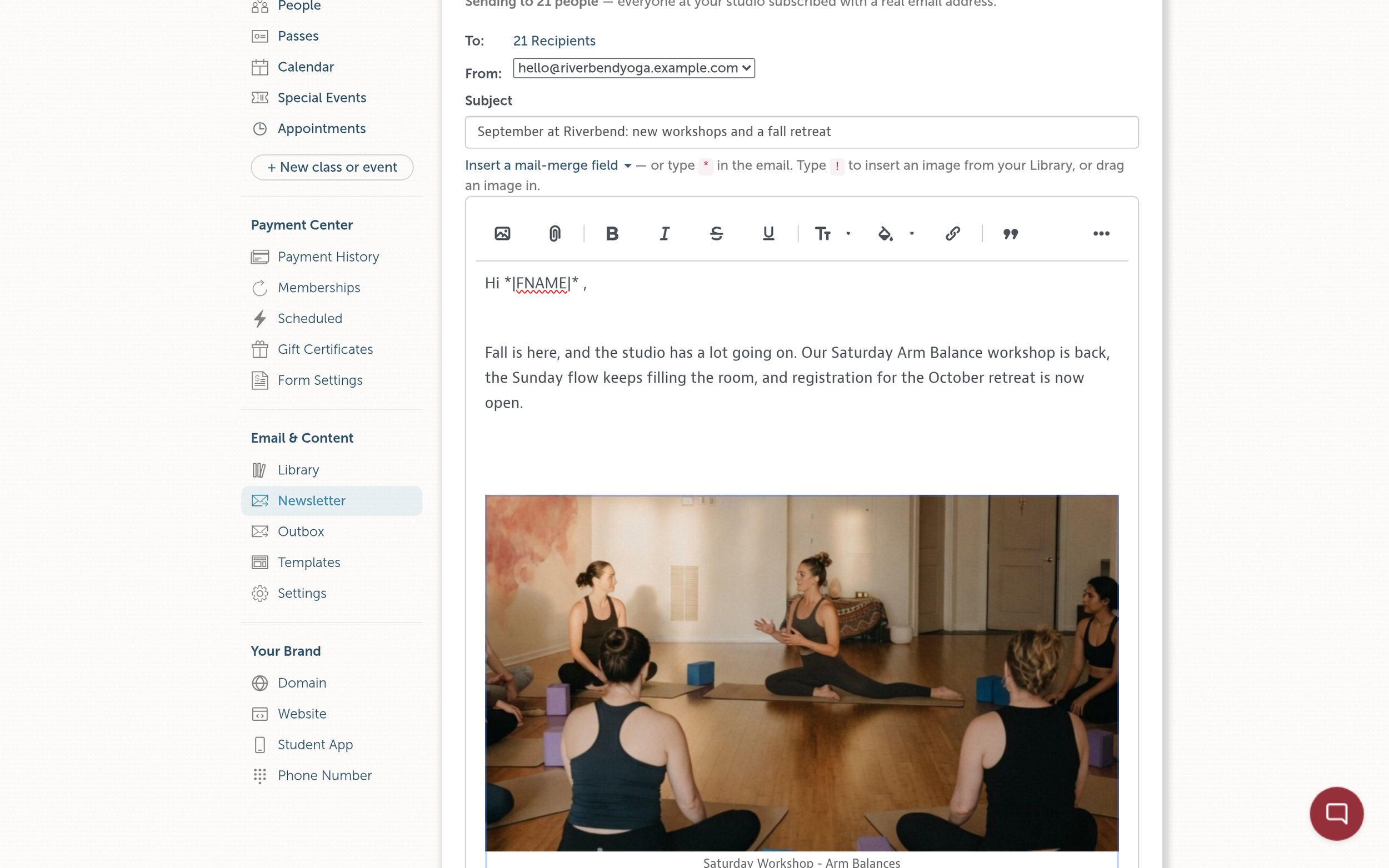
The newsletter composer, with an image from the Library and a first-name merge field.
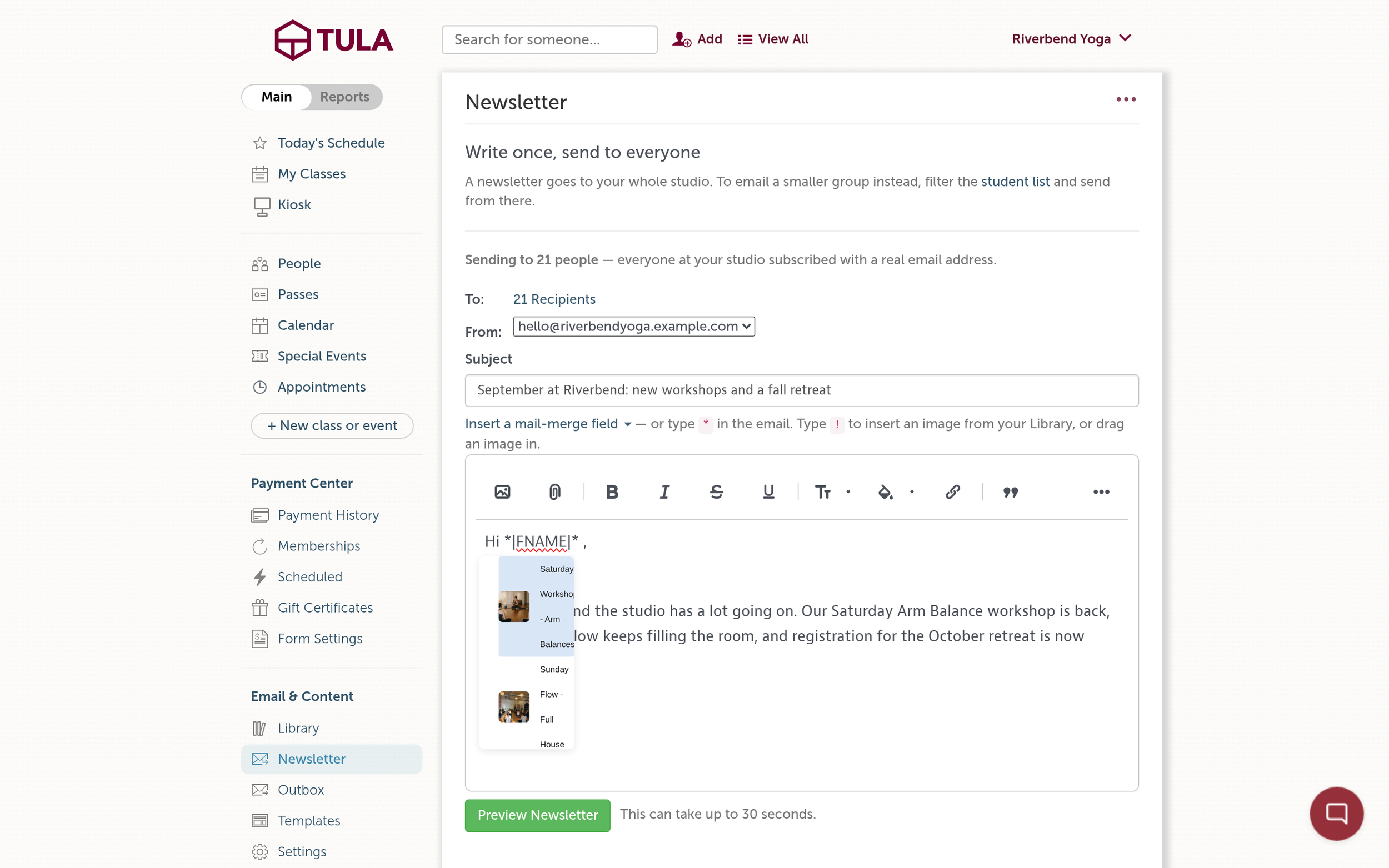
Type ! to pick an image straight from your Library.

Event Pages: every event gets its own home

Your calendar is great for browsing. But when you're promoting a special event, like a workshop, a retreat or a teacher training info session, you want to share one link that tells the whole story and lets people sign up right there.

Now every event has its own page, with a short link you can drop into a newsletter, an Instagram bio, a text message or a flyer. Open any event in Tula and click Public event page to see it.
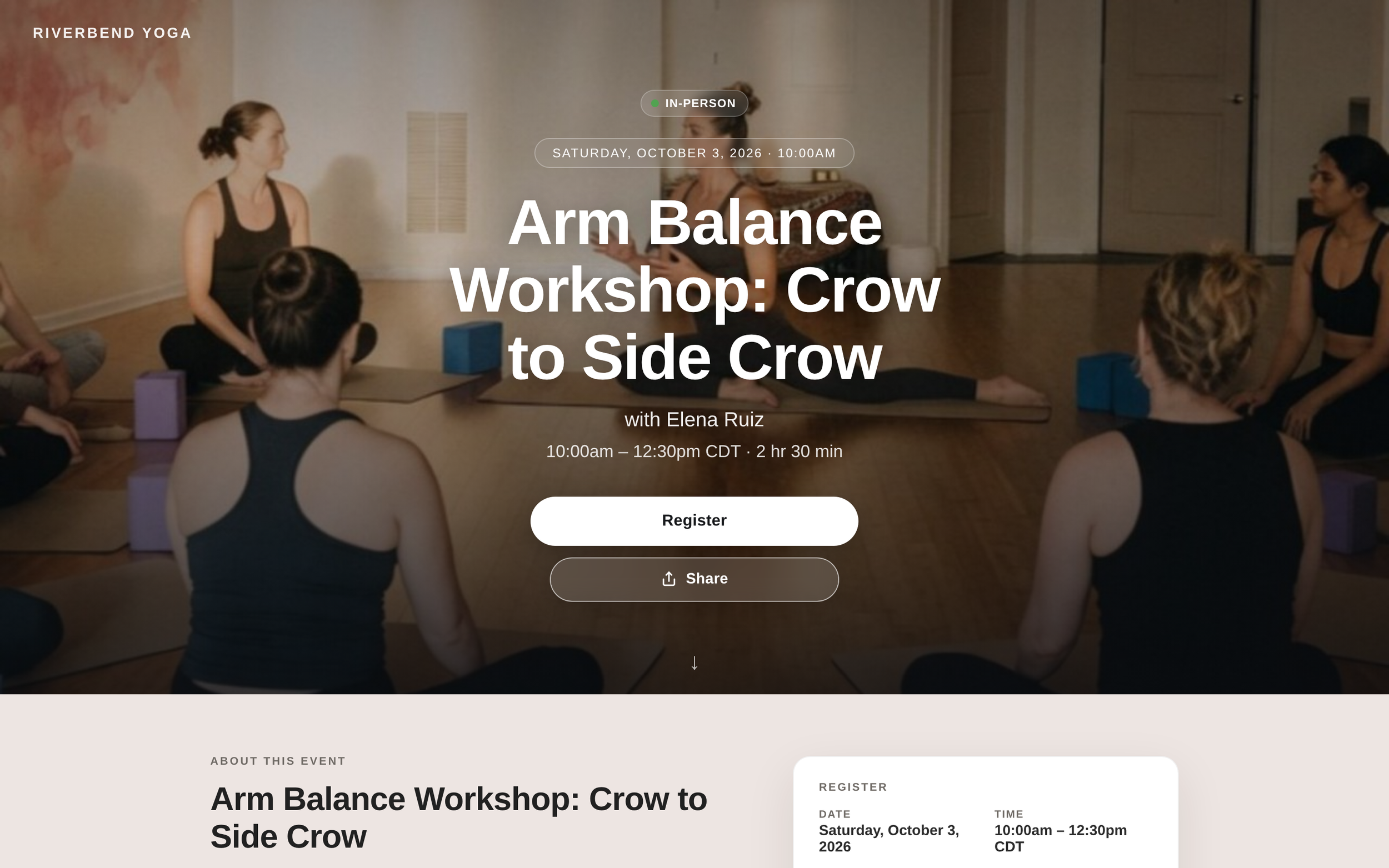
A public event page on desktop.

It looks like your studio

Your branding is front and center, with a large hero photo for the event. Each event now has a full description field that uses the same editor as your newsletters, with room for formatting and images, so you can tell people what to expect, who's teaching and what to bring. And all the details are right there at a glance: date, time and time zone, duration, cost, and how many spots are left.

Events can have their own address, too. There's now a place for your main studio address on the Basic Studio Settings page, and that's what an event page shows by default. If a workshop or retreat is happening somewhere else, enter that location on the event itself and the page uses it instead, directions included.

It does the work for your students

  • Register and pay right on the page, for in-person or virtual, with pricing shown up front.

  • Join the waitlist when the event is full. Students get an email if a spot opens, and they can switch between in-person and virtual when there's room.

  • Accept the waiver as part of signing up.

  • Add it to their calendar in one tap, with Google Calendar or Apple and Outlook.

  • Get directions to wherever the event is happening.

  • Share it with a friend, or copy the link.
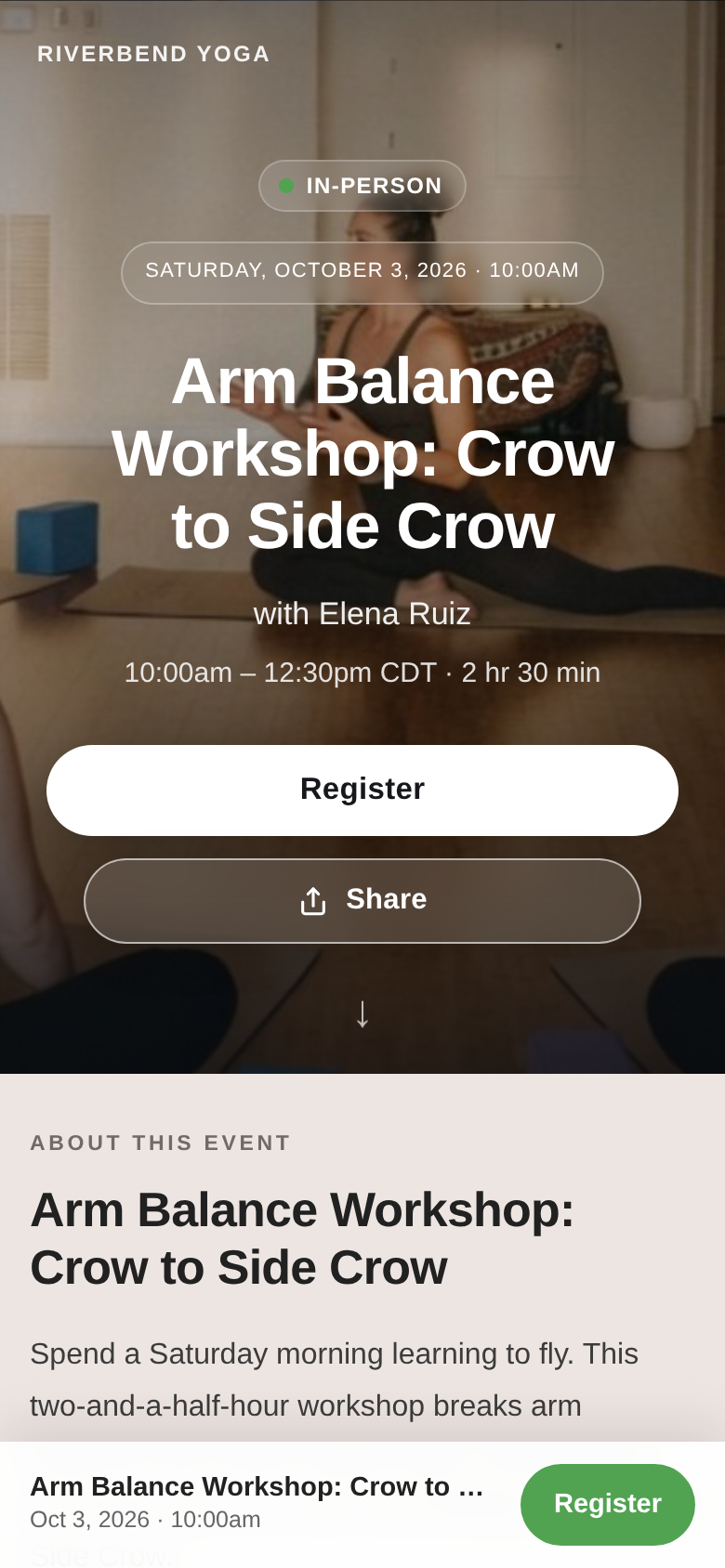
The same event page on a phone.

Students who are already registered see their registration on the page and can manage it there. For virtual events, registered students get a View Broadcast button right on the page, so they don't have to dig for the link.

The page also handles the in-between moments on its own. It tells people when registration isn't open yet and when it opens, when in-person is full but virtual is still available, and when the event has already happened, with a link back to your full calendar.

It's built for phones

Most people will open your event link from a phone, so we designed for that first: a compact hero, details that wrap cleanly, and larger buttons that are easy to tap.

We hope you love it

All of this is included on every plan, there's nothing extra to buy. We can't wait to see what you make with it, and if you have questions or ideas, reply to any of our emails or send a note to support.

To all our customers, as always, thank you. It is an honor to work hard for you every day.
New Features! The Self Serve Kiosk: check in and pay without a front desk

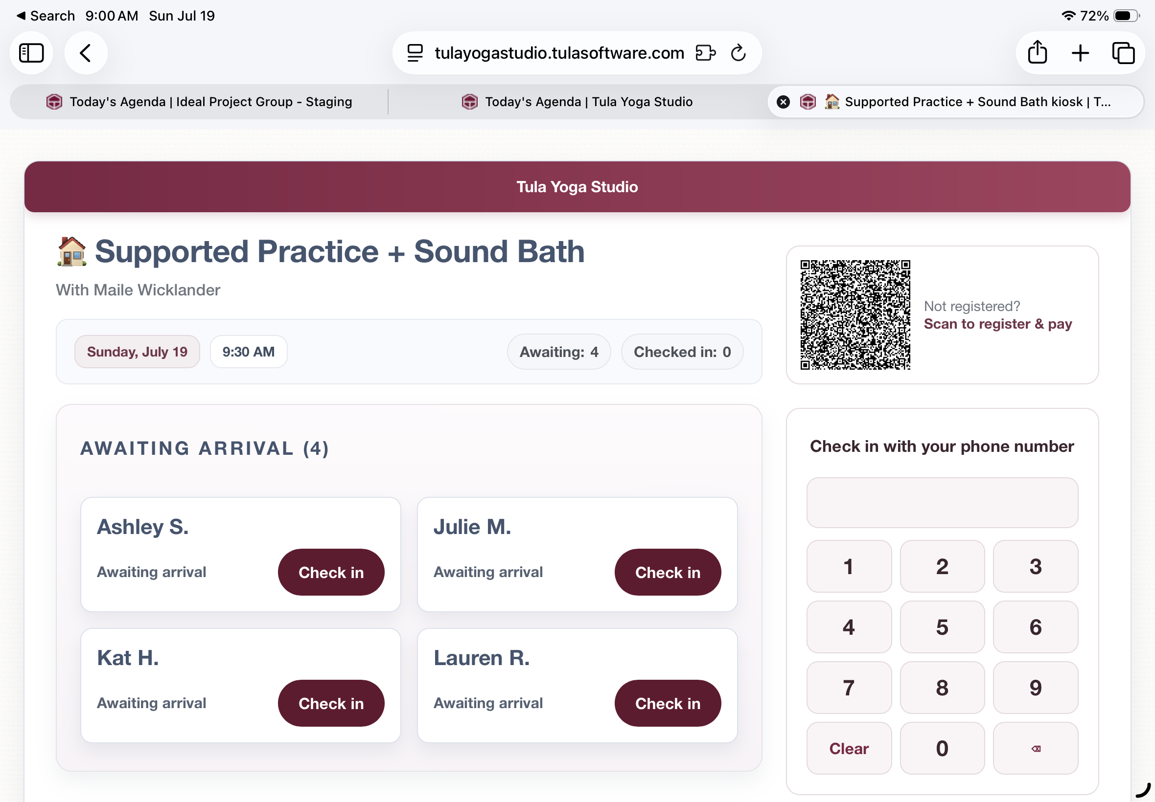
The kiosk started as a screen where registered students tap their name to check in. It can now run the whole front-desk loop on its own: students can look themselves up, check themselves in, pay for class from their own phone, and new students register and pay without anyone touching the desk.

Here's exactly what it does.

Check in with your phone number

The kiosk now has a dial pad. A student types their phone number β€” no login, no search box, no staff. When the number matches an account, the kiosk shows a confirmation: "I'm Sarah L. β€” check me in." One tap and they're checked in.

The screen only ever shows a first name and last initial. No contact information, no account details β€” it's a lobby screen, and it behaves like one.

If the class isn't paid for

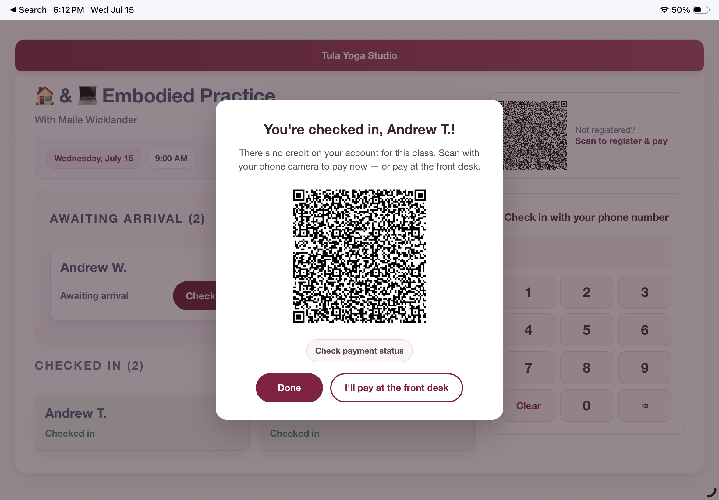
This is the part we think you'll love. When someone checks in without a credit on their account, the kiosk shows them a personal payment code. They scan it with their phone camera and land on your payment form, already filtered to the passes that can pay for that class β€” and greeted by name, with nothing to do but make a payment.

They don't need to be logged in on their phone. The code is tied to their account: the purchase charges immediately, the pass lands on their account, and the class is paid for β€” no matching step in your payment center, ever.

And while they're paying, the kiosk is watching. The moment the payment lands, the screen flips to "Payment received, Sarah L.!" and returns to the ready state. The student sees their own payment confirmed on the studio's screen before they've put their phone away.

Each payment code is single-use and expires on its own. If someone would rather pay at the desk, there's a button for that too.

New students, start to finish

The register & pay code on the kiosk handles people you've never met. A walk-in scans it, fills out your normal payment form, and pays. Tula matches the purchase by email to an existing account β€” or creates the account if there isn't one β€” registers them for the class, and charges the card, all in one step.

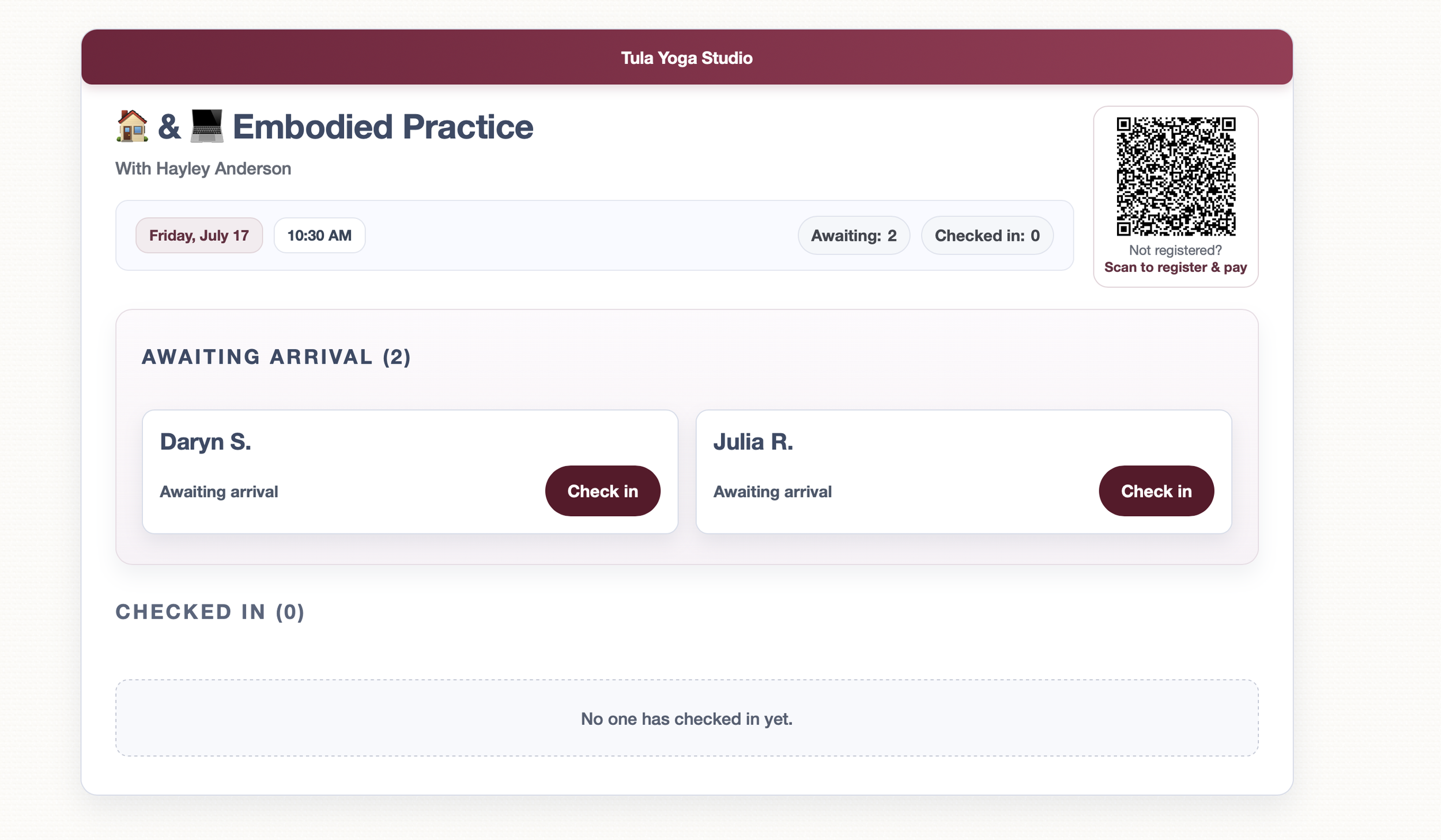
The kiosk refreshes its own roster every few seconds. The new student watches their own name appear under "Awaiting arrival," taps it, and they're checked in. Scan, pay, see your name on the board. No staff involved at any point.

Auto matching-clarity

Every payment the kiosk handles on its own is labeled in your Incoming Payments in the Payment Center as "Auto-matched". A badge shows exactly which purchases were matched automatically and which flow they came from. Manual matches look the way they always have. Phone numbers collected at purchase land on the student's profile.

What the kiosk deliberately doesn't do

The kiosk never creates accounts from the dial pad. If a phone number isn't recognized, it says so and points the person to the front desk β€” because someone the studio has never seen should meet a human, not a form. That's a design decision, not a limitation.

Availability

The kiosk works on any tablet or computer with a browser β€” nothing to install. Turn on kiosk mode for a class the way you already do, and everything above is there. And, this feature is available on all plans for all customers. We hope you love it as much as we do!

Mobile App & Kiosk Updates: Appointments, Payments, Messages, and a Faster Everything πŸ“±

In April we shipped the Mobile Check-In App, and said at the time that we believe Progressive Web Apps can offer a superior experience for mobile users. This update is us following through on that. The check-in app is now a full studio app: five tabs across the bottom β€” Check-In, People, Appointments, Collect, and Messages β€” and it's significantly faster than the version we launched with.

As before: it's the same data as your desktop, there's nothing to install from an app store, and if you already added the app to your home screen you don't need to do anything. It updates itself.

Here's what's new.

People

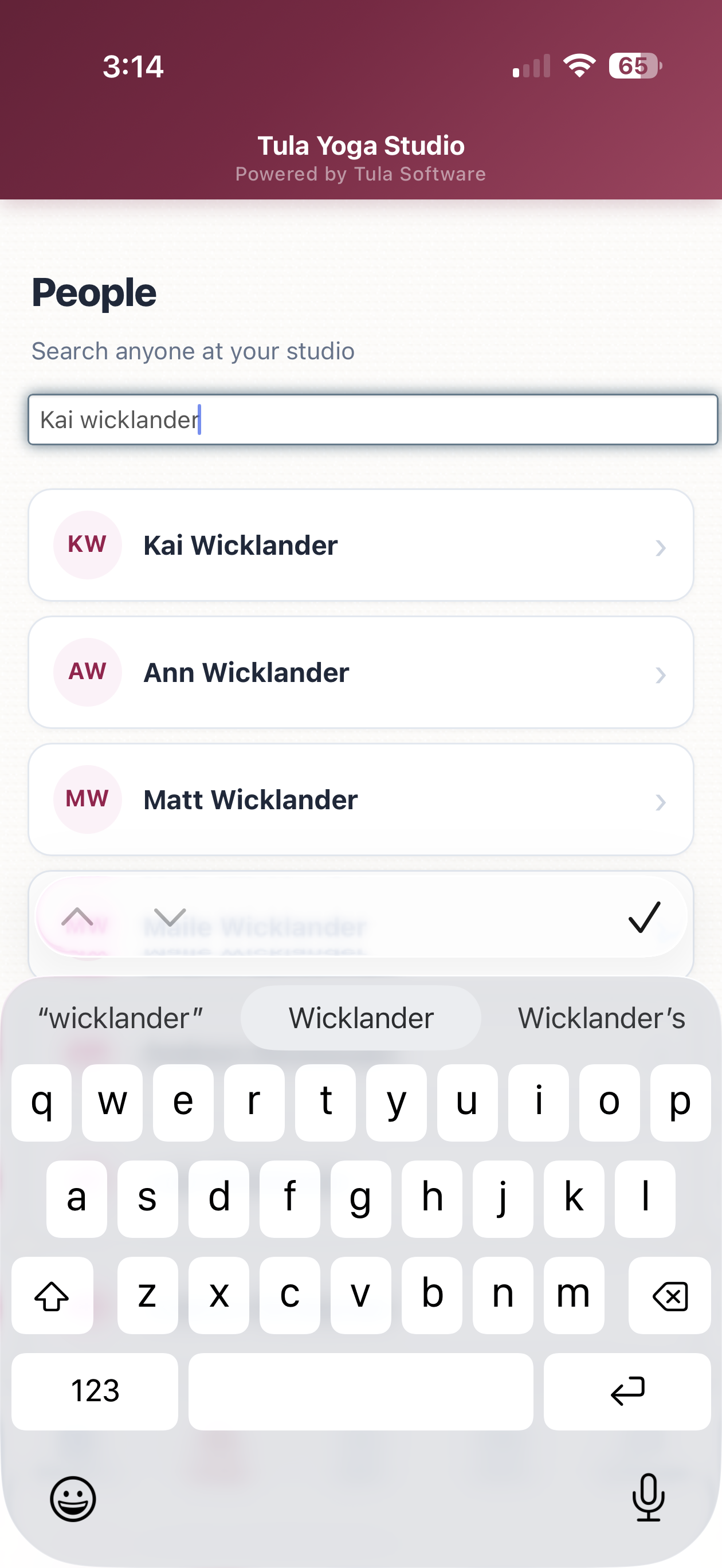
People now has its own tab. Search anyone at your studio by name or email and open their full profile β€” contact info, credits, passes, payment history, attendance, and upcoming registrations. The tab also shows who checked in recently, so the person you just worked with is one tap away.

Appointments

You can now see and manage appointments from your phone:

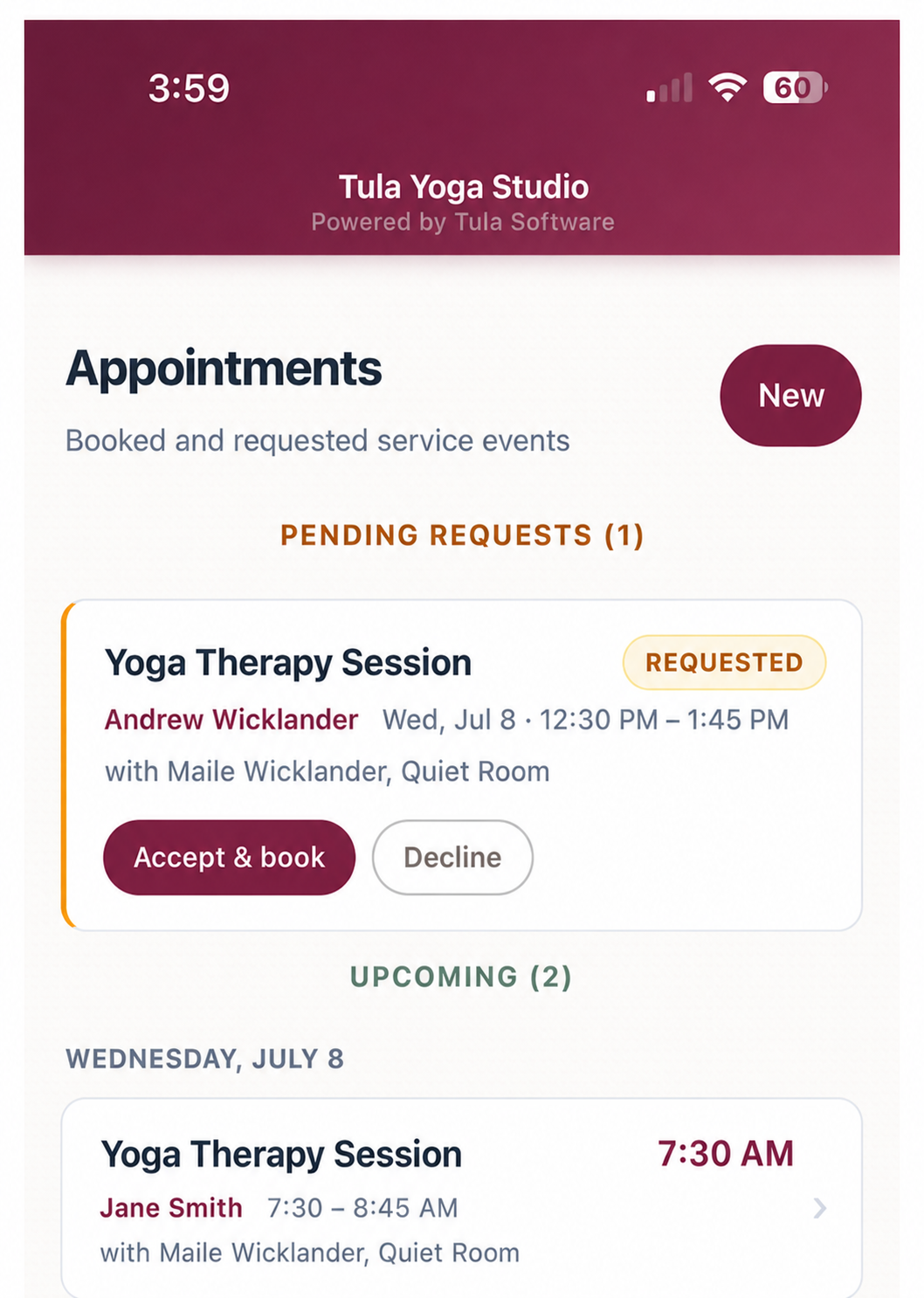
Upcoming appointments are listed by day. Each card shows the service, the client, the time, and the provider. Tapping an appointment opens its check-in screen β€” because an appointment is an event, you check people into it the same way you check them into a class.

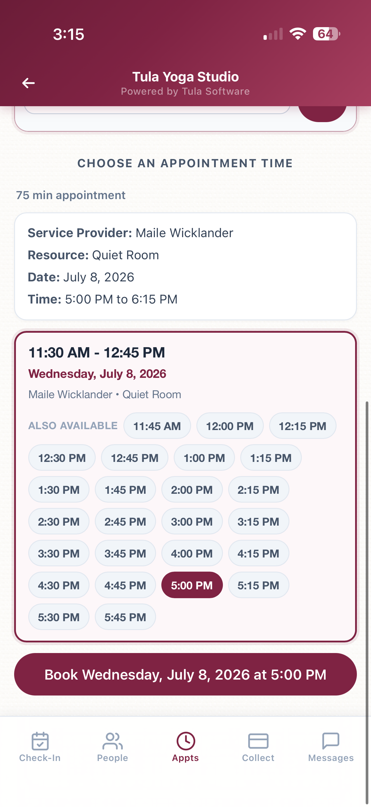
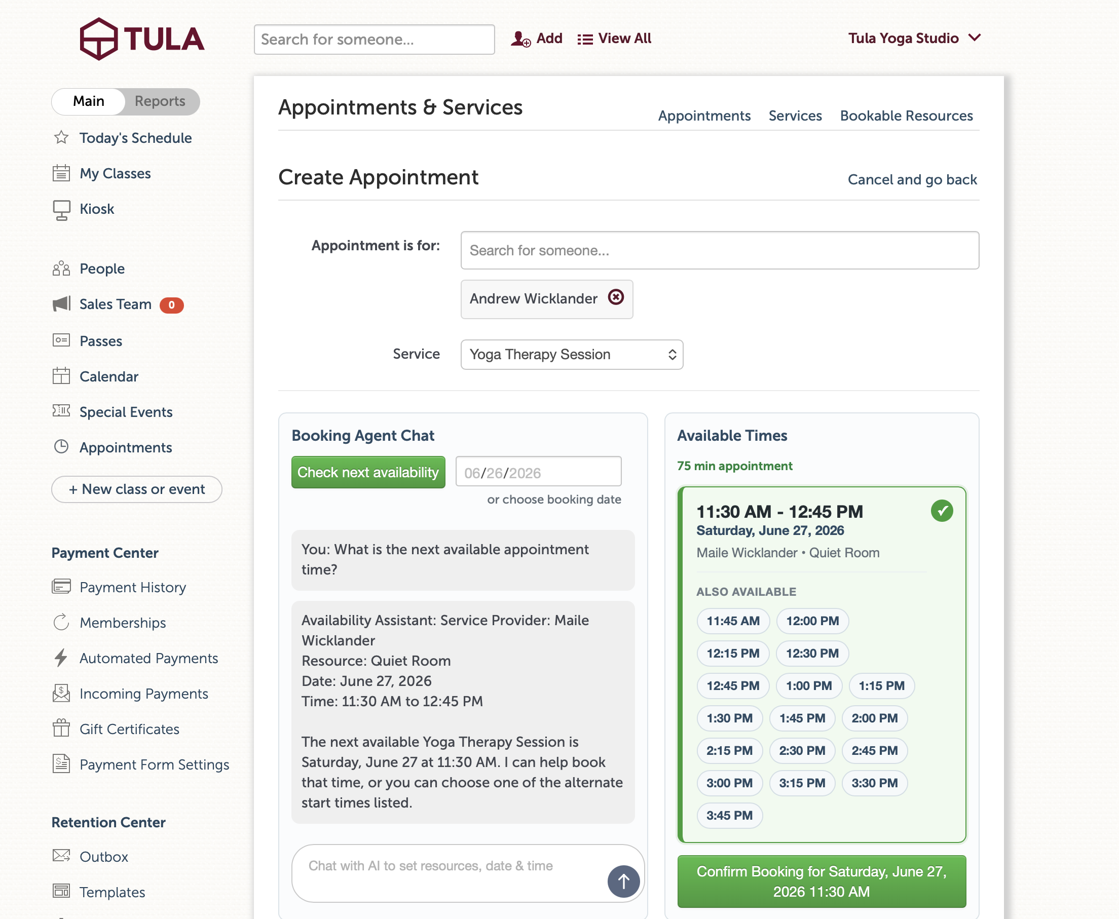
Booking a new appointment works the way the student booking page works: pick the person, pick the service, then ask the booking agent for times ("What's open Thursday afternoon?") or check a specific date. The agent replies with actual open slots, you tap one, and book it. The agent handles provider and room assignment as part of the conversation.

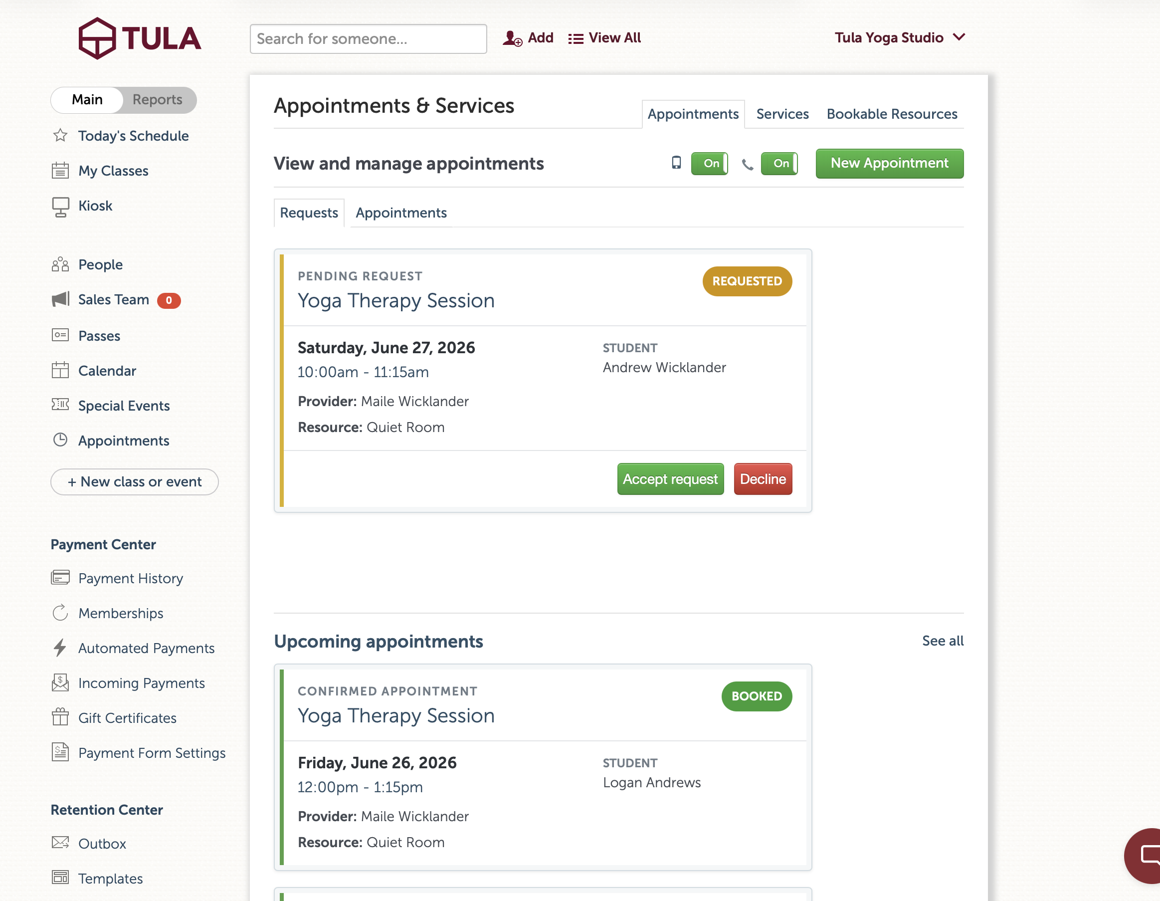
Pending requests from students appear at the top with Accept & book and Decline buttons. Accepting creates the booking and sends the same confirmation texts and emails as accepting from the desktop. Declining notifies everyone too. It's the identical logic behind the desktop requests page and SMS replies β€” just available from your phone now.

Collect payment

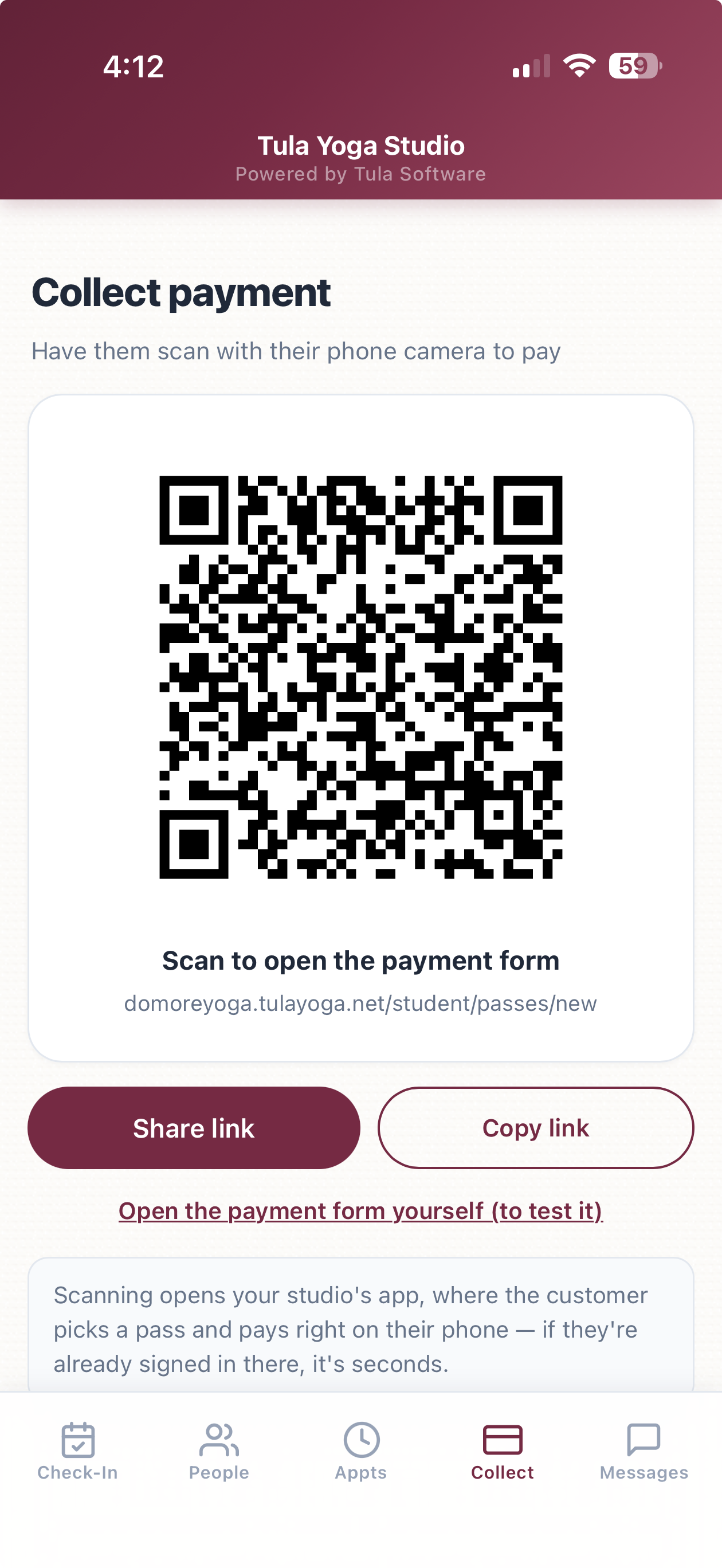
There's a new Collect tab for taking payment in person. It shows a QR code β€” the customer scans it with their phone camera and lands on your studio's app to buy a pass. If your studio has its own domain configured, the QR uses it, so customers who are already signed in there skip login entirely.

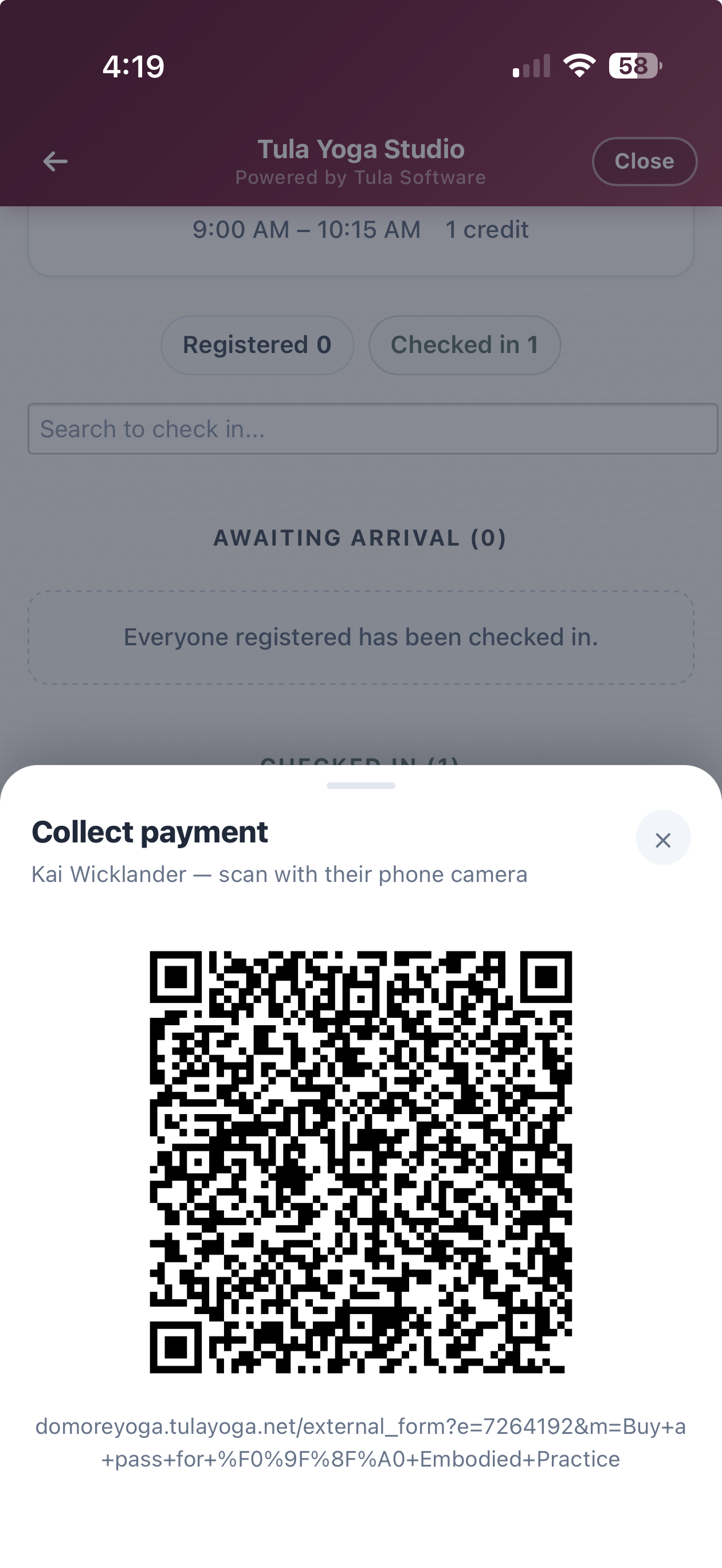
This also connects to check-in. When someone checks in without a pass, their card shows an Unpaid badge with a Collect payment button. Tapping it slides up a QR code for that specific class β€” scanning opens your payment form showing only the pass types valid for that class. You never leave the check-in screen.

Messages

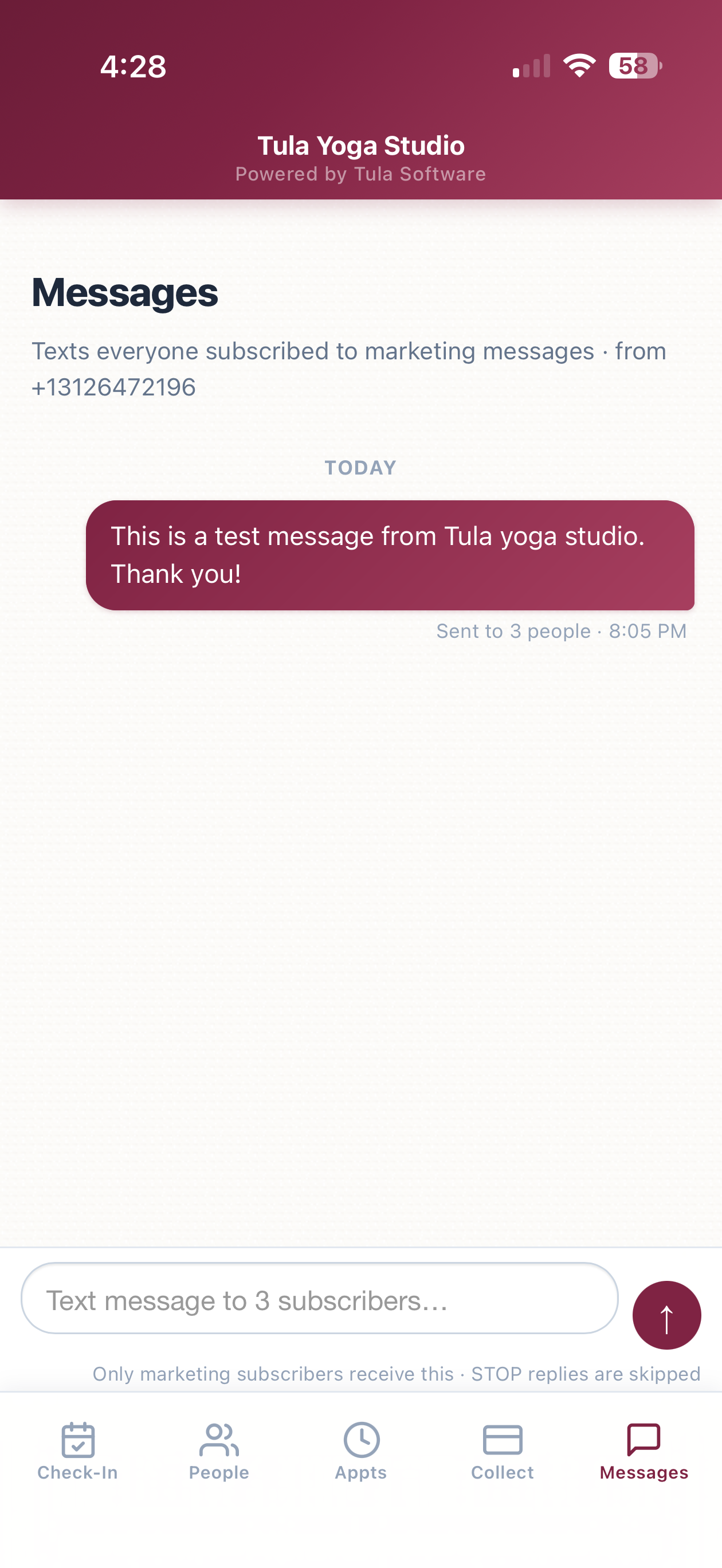
Owners and admins get a Messages tab: a fast way to text everyone subscribed to marketing messages at your studio. It looks like a normal messaging thread β€” your past sends as bubbles, a composer at the bottom, and a recipient count so you know exactly who you're reaching before you hit send.

A few facts about how it works:

Only people with an active marketing text opt-in receive it. Anyone who replied STOP is skipped automatically.

Messages send from your studio's own number, through the same compliance pipeline as the rest of Phone Numbers.

Each message shows real delivery data as carriers confirm it β€” "Received by 30 of 42 people" β€” not just "sent."


The kiosk gets a register & pay QR code

The self-service kiosk got an upgrade too. When a class still has space and has publicly purchasable passes, the kiosk page now shows a QR code next to the roster. Someone who walks in unregistered scans it, pays on their phone, and is registered for that class β€” no staff involvement. Like the mobile app's QR codes, it points at your studio's own domain when you have one set up.

Speed

We rebuilt how the mobile app loads and navigates; we're treating PWAs as a core product.

The app now ships about one sixth of the JavaScript it used to. Less to download, much less for your phone to parse on every launch.

Switching tabs starts loading the moment your finger touches the screen, and the app paints the last version of a page instantly while the fresh one loads behind it. In practice, tab switches feel immediate.

Cold launches show a branded loading screen instead of a white page, and static files are cached on the device so repeat launches skip the network almost entirely.

Dozens of smaller changes: system fonts, no tap delay, press feedback on buttons and cards, and page transitions on browsers that support them.

Getting started

Nothing to set up. If the app is on your home screen it's already updated; if not, open the menu in the upper right of your Tula dashboard, go to Mobile Admin Apps, and follow the instructions. Access works the same as before β€” Owners, Admins, and Desk Staff β€” and the Messages tab is limited to Owners and Admins.

We hope you love this as much as we do and as always, if we can help you with anything reach out to our help email!

πŸ“…πŸ“ž Appointments Upgrades - Now with Voice too!

I’m excited to announce some big new features to our appointments system!

A few weeks ago we launched Phone Numbers, giving studios their own dedicated business phone number for sending text messages. At the time I mentioned that the phone number was really infrastructureβ€”that we were building it as a foundation for future phone-based features.

This release is a great example of this.

Before we get to the phone though, we spent a lot of time improving Appointments itself.

A smoother booking experience

The first iteration of our appointments system was great, but it only presented one time slot at a time as the conversation progressed. Now, we render all the availability options together, making a much faster and smoother booking experience for both you and your customers.

You’ll see a few nice improvements in the booking flow:

  • Multiple verified appointment times presented together.

  • A cleaner, mobile-friendly layout that's easier to scan.

  • Downloadable calendar invitations for admins

  • Better appointment notification text messages.

  • Lots of smaller improvements across both the student and admin experience.

Together these changes make booking feel significantly better.

The same booking experienceβ€”now over the phone!

Once we had the booking experience where we wanted it, the next step became obvious.

If our booking agent is an AI powered booking agent, and someone can book an appointment by chatting on your website...Why shouldn't they be able to call your studio and do the same thing?

If you've set up a Tula Phone Numberβ€”the same one you've been using to send text messages to your clientsβ€”you can now enable Voice Booking.

When someone calls your studio, the phone can answer and help them request an appointment using the same booking intelligence that powers the web experience.

Returning clients are recognized automatically by their phone number and new clients can create an account during the call by verifying their email address.

Still a request

Just like before, every appointment requested from the website or over the phone lands in your Requests tab for approval.

Clients get a much easier booking experience, while studios stay in complete control of their schedules.

Getting started

The updated booking experience is already live for all studios using Appointments.

If you've already configured a Tula Phone Number, you can also enable Voice Booking and start accepting appointment requests over the phone.

If you haven't set up a phone number yet, head to Studio Settings β†’ Phone Numbers. Besides letting you send text messages to your clients, it's now also the foundation for voice bookingβ€”and there are more phone-based capabilities on the way.

As always, let us know what you think.