
I’m really thrilled with a new update we just released, making changes to both our top and left navigations.
With a more organized and intuitive structure, we’ve preserved the same feel we’ve always had, and most links are in generally the same place.
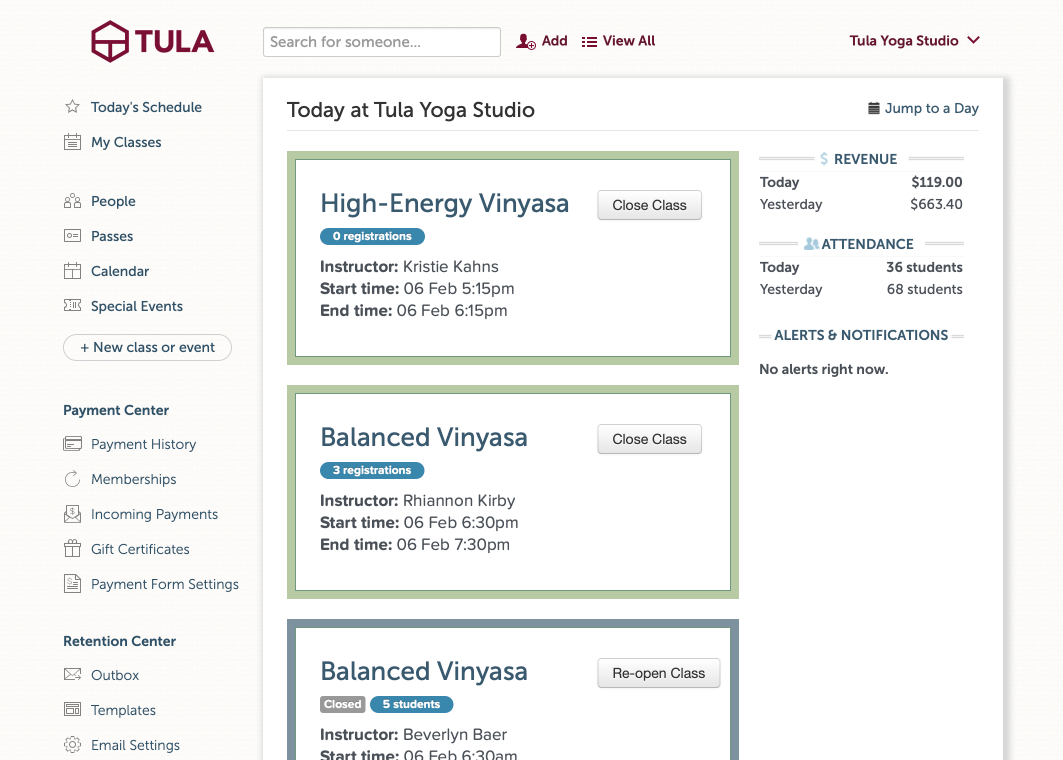
We have however moved a few things around though, most notably, we’ve moved “People” up to the top of the Navigation, bringing it up from the bottom where it used to be listed as a “student filter”.
This brings your students, and communicating with them, right up to the top of the page where it’s fast and easy to take action. We’ve also grouped things in a more coherent way with all the payment center items grouped together just above the retention center.
But my favorite part of this new design, is the “Reports” section at the bottom.

Now, when you click on ‘view all reports’ we expose the full reports menu, replacing the main navigation. And, the reporting navigation remains in tact until you go back to the main menu, allowing you to quickly and easily jump around across different reports.
This update is probably one of my favorite’s that we’ve pushed out on the design front, and I hope you like it us much as we do!